Webpage layout
Following on from the previous article on Stylesheets we are now going to consider the DIV tag, and to a lesser degree SPAN.
Before reading this you should be comfortable with the concept of Stylesheets (CSS).
A quick recap on our knowledge:
- HTML is the language used to describe the contents of a web page
- CSS (Cascading Stylesheets) are used to format the content of the web page
- Almost every HTML tag has an opening and closing tag (example, <p> and </p> opens and closes a paragraph)
The DIV html tag
The <div> tag in it's simplest form it used to group content together into a block. Let's consider this simple html extract:
<div>
<h1>Welcome to my weather station. </h1>
 <p>The weather station in use is the Fine Offset WH1081, and these pages are updated  every 5 minutes. The  meteorological day used at this station ends at midnight</p>
 <p>All data offered by this website and station is from an amateur weather observation station and should be  used and accepted at face-value and compared alongside official sources.</p>
</div>
We have seen this example in the CSS article. The only difference is the <div> at the start and the subsequent </div> at the end. If we ran this in a browser it will look exactly as it did without the <div> tags (one heading, and two paragraphs).
So what's the point? We have grouped the content together into a block and this means we can now manipulate the contents of the block independently of anything else on the page. To do this we must give it a name in order to refer to it.
<div id=”main_block”>
<h1>Welcome to my weather station. </h1>
 <p>The weather station in use is the Fine Offset WH1081, and these pages are updated  every 5 minutes. The  meteorological day used at this station ends at midnight</p>
 <p>All data offered by this website and station is from an amateur weather observation station and should be  used and accepted at face-value and compared alongside official sources.</p>
</div>
The only change is the id=”main_block” within the opening <div> – we have assigned it a name of 'main_block' and we can now reference it within our stylesheet.
To refer to an ID within a stylesheet we precede the name with a # symbol, therefore an extract from our stylesheet could be:
#main_block {
	color: white;
	background-color: blue;
}
We have now told the browser to change the text colour to white and the background of the block to blue when it finds content (in our case, the Div) with an ID of main_block. Most importantly everything out-with this Div block will not have this formatting but the styles defined elsewhere in the stylesheet.
As I mentioned in the CSS article, I am using colour words (white, blue, etc) These are valid but most of the time you will refer to them as numbers as you have a far greater range of colour tones. Google 'css color' for examples)
In addition to affecting the complete block, we can tell CSS only to work on elements WITHIN the block. Again, using the above HTML, but this time the CSS is a little different:
#main_block {
	color: white;
	background-color: blue;
}

#main_block h1 {
	color: red;
	font-size:130%;
}
We have told the browser that everything in the 'main_block' is white, on a blue background, however if you find an <h1> tag, set it's colour to red and increase the font-size a little (as it is a heading).
So, by referring to the main block, then a space, and another tag, we can explicitly write a rule for that tag within the block
A full example:
the HTML extract (I have indented for easy reading)
<body>
	<h1>Welcome to my web page</h1>
	<p>On the following pages you will find weather data</p>
	<div id=”warning”>
		<h1>Weather Warning</h1>
		<p>We are expecting heavy rain.</p>
	</div>
	<p>Thanks for reading</p>
</body>
The CSS
body {  color: black; }

#warning {
	background-color: blue;
	border: 1px solid;
}

#warning h1 {
	color: red;
	font-size: 140%;
}
#warning p {
	color: white;
}
In this example, we start by saying the default colour is black so the <h1> and <p> tags will generate black text. However, the “Weather Warning” text will be in red and a larger font as it has it's on 'h1' rule contained within the 'warning' div. Equally the <p> within warning will be white text. The 'warning' div will have a blue background, and a border 1 pixel wide all around, so create a box. Importantly, the final <p>Thanks for reading</p> will revert to black text as it is out-with the warning div
Positioning
By default when you group content within a <div> … </div> it is contained within a block. Crucially, anything being displayed after the div closed will appear on a new line. So in the above example, the 'Thanks' message starts on a new line under the Div as it is out-with the div.
This is perfect for most scenarios but as you build complex pages you will have many div's and also divs within divs!
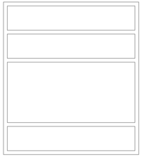
Consider the following layout:
In the past this was done using a table – this is BAD! Tables are for presenting data in a tabular format, but not for setting layout on your site. In years gone by there was little choice but to use tables however the world has moved on!
Let's write the code:
<div id=”temp”>
	<h1>Temperature</h1>
	<p>10C</p>
</div>
<div id=”wind”>
	<h1>Wind Speed</h1>
	<p>0km/hr</p>
</div>
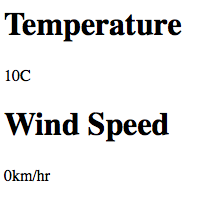
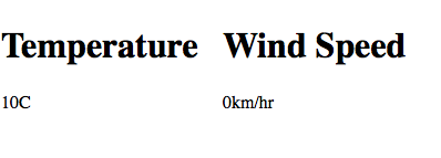
If we do nothing to affect the positioning of the Div's we will get
This is because, as stated above, when a Div closes the next element will appear below it on the web page. Well, that's the default but let's over-ride that – let's float!
Floating is used in Stylesheets to assist in your layout. When you float something you in effect force its position on the web page, and tell the browser that the next thing will be hard against it's edge rather than below it.
So, add some CSS...
#temp {
	float: left;
}
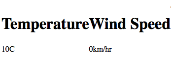
This will position the 'temp' div to the left of the page and as we are floating it, the next elements will be hard against it's right edge. (Think of your div block as having an imaginary box around it – it often helps visualise it – nothing out-with the <div> can come into the box, but elements can wrap around it, or against it's edge)
You can see the 'wind' div is now hard against the floated 'temp' div. Lets tidy it up a little..
#temp {
	float: left;
	width: 200px;
}
This now forces 'temp' div to be 200 pixels wide, so gives it some breathing space! We have now achieved our result.
IDs and Classes
We have introduced the ID concept at the start of this article – it allows you to name elements (in our case Divs). Importantly, every ID on the page should be unique otherwise the browser may become confused.
If you want the same styles to apply to several Divs use a class name.....
<div class=”data_box”>
	<h1>Temperature</h1>
	<p>10C</p>
</div>
<div class=”data_box”>
	<h1>Wind Speed</h1>
	<p>0km/hr</p>
</div>
You can see I have used “data_box” twice. I can do this as it is a class.
Now the CSS:
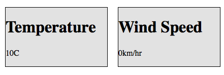
.data_box {
	float: left;
	width: 200px;
	background: grey;
	border: 1px solid;
	margin: 10px;
}
I am now using the same definition on both Div's. Note, you refer to a class in CSS with a dot at the start, rather than a #
Now, both Divs will have the same width, colour, a nice border all round and a margin of 10 pixels between them.
Mix and match
<div id=”temp” class=”data_box”>
	<h1>Temperature</h1>
	<p>10C</p>
</div>
<div id=”wind” class=”data_box”>
	<h1>Wind Speed</h1>
	<p>0km/hr</p>
</div>
Each Div now has a Class AND an ID. Why? Well, we set styles they have in common using the class, but can add unique style for an ID if needed.
Our new CSS
.data_box {
	float: left;
	width: 100px;
	background: grey;
	border: 1px solid;
	margin: 10px;
}

#wind {
	color: red
}
Both divs will be identical except 'wind' has a text colour of red
In HTML5, where you could use Div before, you can now use header, footer, aside, main, article or section. These were introduced because they are more meaningful terms.
<header> - this is used to group elements at the start of an article, aside, or section;
<footer> - this is used to group elements at the end of an article, aside, or section;
<aside> - this is used to group elements that are not an essential part of the content and typically appear to one side;
<article> - this is used to group elements that have a logical connection with each other, but are not essential to be related to the elements outside the article grouping, you can have several article elements and can nest them like div;
<section> - this is very like 'div', it is a way of grouping elements, it can appear multiple times and be nested; it is often used when the grouped elements do have a connection with those outside the section grouping.
<main> - this is a special grouping tag, it can only appear once, it should not include any navigation links, header nor footer information; it is used to denote the part of a web-page that really matters, the bit you might choose to read first or have displayed when you first visit the page.
Spans
Spans are used far less frequently than Divs, because little else than text can be embedded within a span element, but worth a few moments ….
A span allows you to reference a piece of text within an element. So let's keep it simple.
<p>This text could be red</p>
Assuming we only want the word red to be coloured we would write this as...
<p>This text could be <span id=”highlight”>red</span></p>
Notice I open my paragraph, have some text, open a span and give it an ID, have text, close the span then close the paragraph.
The css would then be
p { color: black;}

#highlight {color: red; }
You will use 'span' rarely but it occasionally has a use.
Float Warning
Be careful with floating!! Don't over float!! If you do float, then you need to remember that the very next element will be hard up against the floated element
In the example we have worked on, let's add a final paragraph:
<div id=”temp” class=”data_box”>
	<h1>Temperature</h1>
	<p>10C</p>
</div>
<div id=”wind” class=”data_box”>
	<h1>Wind Speed</h1>
	<p>0km/hr</p>
</div>
<p>Thanks for reading</p>
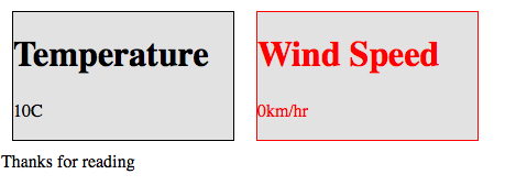
Because both divs are using the “data_box” class, which has a float left, the very next thing (in our case the “thanks” paragraph) will appear hard against it
This is not the effect we want! Best to contain the message in it's own div and make sure it is not floated.
<div id=”temp” class=”data_box”>
	<h1>Temperature</h1>
	<p>10C</p>
</div>
<div id=”wind” class=”data_box”>
	<h1>Wind Speed</h1>
	<p>0km/hr</p>
</div>
<div id=”msg”>
	<p>Thanks for reading</p>
</div>
And the CSS would be:
#msg {
	clear:both;
}
The clear:both tells the browser to ignore any floats for preceding elements and ensure this element (the msg div) has the whole line to itself.
Complete code example
Here is the complete source code, with the style sheet written into the HTML. Normally the Stylesheet would be in it's own file, as per the discussion on the previous article
https://cumuluswiki.org/files/divlayout.txt
Tips
- When I am designing a page, I often find it useful to use CSS to put borders around my 'divs' to help me visualise. Including “border: 1px solid;” will draw boxes around the div – you can remove it later.
- make sure you close your 'divs'. Forgetting can have disastrous results on the layout
And finally
So there we have it, <div>, <section>, <article> etc. in a nutshell. You will learn to love HTML content grouping elements as they give you excellent control, and you will use them everywhere. Most designs have an overall 'container' to wrap everything up. Try to visualise the layout with boxes around it, you should be thinking something like that shown in the figure. A basic shell for a webpage often starts like this...
<body>
<article id=”container”>
        <h1> some text </h1>
	<header>
         <h2> some text </h2>
           <p> some text </p>
	</header>

	<nav id=”menu”>
	</nav>

	<main id=”content”>
          <section>
          <h2> some text </h2>
            other HTML
          <section>
          <section>
          <h2> some text </h2>
            other HTML
          <section>
	</main>

	<footer>
	</footer>
</article>
To further develop the design, include
<aside> some HTML content </aside>
to add in information not directly related to the
<main> some HTML content </main>
.
Your Stylesheets could position this to the right hand side of the content in 'main' for viewing on a monitor, but below it for narrower media when you print or view on some other devices. Have a look at the HTML used on those web-sites you like, as most browsers offer 'view source'.
The next article to read ……
Editing_content_of_a_webpage_using_either_HTML_or_Script. See Editing_content_of_a_webpage_using_either_HTML_or_Script.
Original article Daj 18:07, 13 February 2011 (UTC)
Updated to HTML5 standard Sfws (talk) 23:41, 22 April 2015 (PDT)
