Charts - Wind charts
Introduction
The Wind charts submodule consists of two charts:
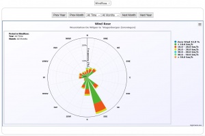
- Wind Rose - Plotting the wind direction and speed in a polar chart;
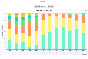
- Monthly Windrun - Plotting the windrun in a stacked column chart;
Below you will find an example image of each chart and an explanation of the origin of the numbers.
Wind Rose
The rather complex chart presents the wind speed and direction in a so called polar chart. For each direction in the compass rose a stacked column is displayed as a cone towards the centre (or from the centre outward). The display is subdivided for every year and every month within the year.
The chart is configured with the following parameters (explained in the chapter Charts):
  [Graphs]
  WindRoseNrOfWindforceClasses=6                           (default = 6)
  WindRoseMaxWindSpeed=60                                  (default = 60)
  WindRoseInversed=false | true                            (default = false)
Calculation of the Wind Rose
The wind rose is based on the figures in the monthly log files. Those files are read and every measurement has a Latest Wind Speed (See terminology, field nr 14).
The direction is taken from the Current Windbearing, field nr 25. However, field nr 25 does exist only from version 1.9.2 and up. If the datafile is from an earlier version the next best value is taken for the wind direction namely the average windbearing, field nr 8.
Every record in the database is taken as a sample and counted for the speed and direction classes and as such presented in the chart. Especially for the high frequency sampling (one or five minutes) this will give an accurate picture of the wind speed and direction figures. For the lower frequency sampling this picture may be less accurate for the month level.
NOTE: because of this calculation this graph takes a high toll on the performance of CumulusUtils: first because reading the monthly logs is expensive - especially when sampling on minute or five minute frequency - and secondly because the list is long (millions of records when using minute sampling) and making the sub selections per month again takes its toll. Optimisation of this chart is continuous work in progress. Performance of CumulusUtils is highly dependent on the hardware it is running on.
Number of compass sectors
The number of sectors in the compass rose can be either 16 or 8 depending on the weather station you have. CumulusUtils takes the number of sectors from the Cumulus.ini file, section [Display], parameter NumWindRosePoints. From there CumulusUtils calculates the wind classes and takes the values from the datafiles which it then plots. So far so good.
The labels for the compass rose are taken from the language file section [Graphs], parameter CompassSectors, which has an English default value of 16 directions:
["N", "NNE", "NE", "ENE", "E", "ESE", "SE", "SSE", "S", "SSW", "SW", "WSW", "W", "WNW", "NW", "NNW"]
to be translated for other languages of course when required.
Now obviously when you only have 8 sectors in the station you only need 8 directions in this string so my advice would be you turn this string into :
["N", "NE", "E", "SE", "S", "SW", "W", "NW"]
which gives you the labels as wanted. NOTE: This string may NOT contain single quotes!!
This is not done in code because the user most likely will have to translate and it has to be seen as set-up even if you are English.
Wind Run
Total wind run per day is shown as a stacked column per month. For every day in a month the wind run is taken and counted into the class it belongs to.
The wind run class width parameter value WindrunClassWidth is given by the user who estimates a width such that the number of classes is reasonable depending on unit and actual local wind conditions:
 [Graphs]
 WindrunClassWidth=75
The chart can be shown for All Time or for a specific year, selectable by the user.
Configuration of the Wind charts and YADR report
The configuration of the charts and YADR report is actually straight forward but the user needs to be aware of this configuration especially when having configured CumulusMX to use imperial units and/or the station is residing in a region with dominantly very high or very low winds.
Windrose configuration
- As stated above the number of Windrose sections is taken from the CumulusMX inifile parameter NumWindRosePoints and you need to adjust the compass direction texts as indicated above
- Then the user has to to reflect that the Windrose is not very good in displaying very small percentages. As a hurricane will be very rare you should define your windspeed above which you group all windspeeds in only one class. So be aware that maybe a hurricane wind is interesting but the Windrose won't be able to show it if it occurs only once in ten years for two hours. So if your normal windspeeds go up to 50 km/hr (or let's say 30 mi/hr) you set WindRoseMaxWindSpeed=50 (or 30 when mi/hr) in the unit you use. This number is not converted in any way and is simply a limit for the data as it is in your logs.
- Then the user needs to define how many classes need to be in the Windrose. As above, too small classes won't sufficiently show some windspeeds, too large slasses won't hold enough information. Experiment with WindRoseNrOfWindforceClasses to get it right.
The defaults for the parameters for the Windrose are good for km/hr but anybody using deviating units should reflect on these parameter values.
Windrun configuration
The Windrun is a bit more automated but still the user has to define the class width through the parameter WindrunClassWidth (which has a default of 75). Again the default is OK for a distance unit of km, reconsider if using imperial. Note that if you use a speed unit of m/s, the distance of the Windrun will be in km.
With the WindrunClassWidth the following is calculated:
- The maximum windrun which ever occurred on the station is determined (call it MaxWindRun)
- The is calculated as:
- Then all classes are defined as (Loop over the number of windrun classes as calculated above)
These classes are used for the Windrun chart.
YADR Report class configuration
A similar procedure is used for the legend under the YADR Windrun report with the difference that here always 13 classes are used. Reason is that the extreme classes are easier to see in this colour accented text report than it is in the percental Windrun chart.


![{\displaystyle class[i]=WindrunClassWidth+i\times WindrunClassWidth}](https://en.wikipedia.org/api/rest_v1/media/math/render/svg/25847fdafb5896586e3092441de4672811c13ab1)