The Alternative Interface (ai.cmx): Difference between revisions
NeilThomas (talk | contribs) |
NeilThomas (talk | contribs) |
||
| Line 11: | Line 11: | ||
It has been developed to run in tandem with the existing Interface, has the same pages (plus one to manage the themes), and each page does the same as the Interface. This is a deliberate choice so that you don't need to do anything differently. The menu is however organised a little differently; I have grouped together pages that just show you your weather data and those that enable you to configure or edit it. My reasoning is simply to reduce the width of the menu for smaller screens. |
It has been developed to run in tandem with the existing Interface, has the same pages (plus one to manage the themes), and each page does the same as the Interface. This is a deliberate choice so that you don't need to do anything differently. The menu is however organised a little differently; I have grouped together pages that just show you your weather data and those that enable you to configure or edit it. My reasoning is simply to reduce the width of the menu for smaller screens. |
||
One other alteration is on the main dashboard. I have moved the alarms panel to just underneath the sun and moon times. When using the Interface I like to be made aware of any alarms without scrolling; especially ones about the system. This page is already being modified to improve its layout - I am keen to also get the weather |
One other alteration is on the main dashboard. I have moved the alarms panel to just underneath the sun and moon times. When using the Interface I like to be made aware of any alarms without scrolling; especially ones about the system. This page is already being modified to improve its layout - I am keen to also get the weather record set LEDs displayed. |
||
=== Overview === |
|||
infact and provides similar facilities. It's primary purpose at this stage is to make its style fit with the default website and provide the facility to change the colour theme used throughout the site. Some pages have had some cosmetic or layout changes and the menu has been condensed. |
|||
Below are a number screenshots of various aspects of the alternative interface. |
|||
{| class="wikitable" style="vertical-align: top;" |
|||
<gallery mode="slideshow"> |
|||
|- |
|||
File:AI_Alarm_Settings.png|The Alarm Setting page. It is now responsive. |
|||
! Screenshot !! Information |
|||
File:AI_Dashboard.png|A reworked dashboard. Alarms ar at the top. Looking to include records as well. |
|||
|- |
|||
File:AI_Data_Logs_Editor.png|The Data Logs Editor page. The table scrolls sideways within the page frame. |
|||
| [[File:AI_Theme_Selector.png|thumb]] || style="vertical-align:top;"| The included theme selector page. You can select a theme<br/>(lots included) and set it active for the current session or make it permanent.<br/>You can also reset to the original theme. At the<br/>bottom of the page are the email settings for sending emails. |
|||
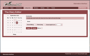
File:AI_Diary_Editor.png|A re-designed diary editor. The calendar also uses the theme colours. |
|||
|- |
|||
File:AI_Extra_Sensor_Settings.png|301px|thumb|This and most pages that use 'alpaca' forms are generally unchanged apart from the theming. Also shows one of the dropdown menus. |
|||
| [[File:AI_Weather_Records.png|thumb]] || style="vertical-align:top;"|<strong>Weather view pages</strong><br/><br/>The 'view records' page. Note that you can select the same sub-sets as<br/>in the normal interface. The only difference is the selectors are actually buttons, not lists. |
|||
File:AI_Gauges.png|The standard Gauges page but now the tooltips reflect the theme colours. |
|||
|- |
|||
File:AI_Interface_Data_Log_Viewer.png|The data log editor |
|||
| [[File:AI_NOAA_Month_Reports.png|thumb]] ||style="vertical-align:top;"| There are some small changes to the way that this page works.<br/>The date selector now automatically closes when you select a date and the report is loaded. |
|||
File:AI_Theme_Selector.png|The included theme selector. Themes can be temporary or permanent - it's up to you. |
|||
|- |
|||
</gallery> |
|||
| [[File:AI_Extra_Sensors.png|thumb]] ||style="vertical-align:top;"| If you have extra sensors on your weather station this is where the readings will<br/>be displayed. It uses an HTML table as in the normal interface but these have all been made<br/>responsive. |
|||
|- |
|||
| [[File:AI_Compare_Charts.png|thumb]] ||style="vertical-align:top;"|The new 'choose your own date' charts are included.<br/>The only difference is that ALL charts can now be zoomed to show more detail.<br/>On a tablet this is done with two fingers, but with the mouse just press and drag. |
|||
|- |
|||
| [[File:AI_Dashboard.png|thumb]] || style="vertical-align:top;"|This is the alternative dashboard. I have made some<br/>changes to this page as I always like to see any<br/>alarms that have been set as soon as the page<br/>loads.<br/><br/>This page is also on my main list for future development.<br/>I want to include LEDs for Records Set and probably add<br/>extra Almanac data but as a popup so that it<br/>doesn't interfere with the main page data. |
|||
|- |
|||
| [[File:AI_Data_Log_Editor.png|thumb]] || style="vertical-align:top;"|The first screenshots of the 'Edit/Configure' pages.<br/>All 'Edit' pages with a date selector modified have had it modified.<br/>The date selector will now disappear as soon as you select a date<br/> and the data loaded. The page also automatically loads the<br/>first set of data on load so you don't need<br/>to click any buttons to start. |
|||
|- |
|||
| [[File:AI_Dayfile_Viewer-Editor.png|thumb]] || style="vertical-align:top;"|The Day File Viewer/Editor has been forced to fit within the page layout.<br/>However, it still scrolls sideways so that you can<br/>view all the data.<br/><br/>You can still edit it as this is still done within a popup window. |
|||
|- |
|||
| [[File:AI_Diary_Editor.png|thumb]] || style="vertical-align:top;"|This page has been restructured to improve its design.<br/><br/>The calendar has also been themed so that when you choose a new<br/>theme, the calendar colours change as well.<br/><br/>Future versions of this page may be combined with the<br/>Current Conditions editor. |
|||
|- |
|||
| [File:AI_Extra_Sensor_Settings.png|thumb]] || style="vertical-align:top;"|This is an example of the Extra Sensor Settings page.<br/><br/>Many of the 'Settings' pages use the 'Alpaca' library to generate the required forms.<br/><br/>None of these have been changed except for the page framework. In action there is no difference. |
|||
|- |
|||
| [[File:AI_Records_Editor.png|thumb]] || style="vertical-align:top;"|The Records Editor pages all use standard HTML tables and a library to enable you to edit them.<br/><br/>The only changes made to these pages was to make the buttons work with the new themes and the use a<br/>'splash' screen when you load data. This makes it more obvious that the system is busy. |
|||
|} |
|||
Note: Better screenshots will be provided shortly. |
|||
Where the above screenshots vary in colour, it is because I temporarily loaded an alternate theme. You get 30 themes included that can also be used with the default website. |
|||
| ⚫ | |||
| ⚫ | |||
=== Installation === |
=== Installation === |
||
Revision as of 17:19, 10 September 2021
An Alternative (additional) Interface
Overview
Following the release of the responsive default website for CumulusMX, I have now developed an alternative interface pack so that both your live site and your CumulusMX Console site look similar. The general layout is the same but without a sidebar. The header and footer are static by default but both can be made to scroll if preferred.
Like the default website, you can change the theme with impacts all elements on the pages including tooltips and calendars. Unlike the default site, you get nearly 30 colour themes included which can also be used with the default site.
How it fits with the existing inteface
It has been developed to run in tandem with the existing Interface, has the same pages (plus one to manage the themes), and each page does the same as the Interface. This is a deliberate choice so that you don't need to do anything differently. The menu is however organised a little differently; I have grouped together pages that just show you your weather data and those that enable you to configure or edit it. My reasoning is simply to reduce the width of the menu for smaller screens.
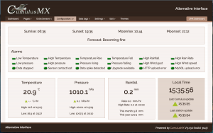
One other alteration is on the main dashboard. I have moved the alarms panel to just underneath the sun and moon times. When using the Interface I like to be made aware of any alarms without scrolling; especially ones about the system. This page is already being modified to improve its layout - I am keen to also get the weather record set LEDs displayed.
Overview
Below are a number screenshots of various aspects of the alternative interface.
| Screenshot | Information |
|---|---|
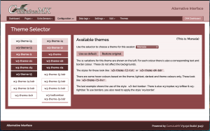
| The included theme selector page. You can select a theme (lots included) and set it active for the current session or make it permanent. You can also reset to the original theme. At the bottom of the page are the email settings for sending emails. | |
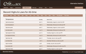
| Weather view pages The 'view records' page. Note that you can select the same sub-sets as in the normal interface. The only difference is the selectors are actually buttons, not lists. | |
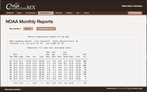
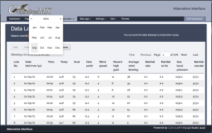
| There are some small changes to the way that this page works. The date selector now automatically closes when you select a date and the report is loaded. | |
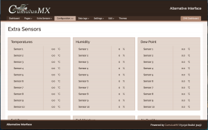
| If you have extra sensors on your weather station this is where the readings will be displayed. It uses an HTML table as in the normal interface but these have all been made responsive. | |
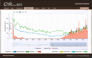
| The new 'choose your own date' charts are included. The only difference is that ALL charts can now be zoomed to show more detail. On a tablet this is done with two fingers, but with the mouse just press and drag. | |
| This is the alternative dashboard. I have made some changes to this page as I always like to see any alarms that have been set as soon as the page loads. This page is also on my main list for future development. I want to include LEDs for Records Set and probably add extra Almanac data but as a popup so that it doesn't interfere with the main page data. | |
| The first screenshots of the 'Edit/Configure' pages. All 'Edit' pages with a date selector modified have had it modified. The date selector will now disappear as soon as you select a date and the data loaded. The page also automatically loads the first set of data on load so you don't need to click any buttons to start. | |
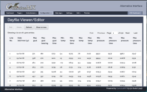
| The Day File Viewer/Editor has been forced to fit within the page layout. However, it still scrolls sideways so that you can view all the data. You can still edit it as this is still done within a popup window. | |
| This page has been restructured to improve its design. The calendar has also been themed so that when you choose a new theme, the calendar colours change as well. Future versions of this page may be combined with the Current Conditions editor. | |
| thumb]] | This is an example of the Extra Sensor Settings page. Many of the 'Settings' pages use the 'Alpaca' library to generate the required forms. None of these have been changed except for the page framework. In action there is no difference. |
| The Records Editor pages all use standard HTML tables and a library to enable you to edit them. The only changes made to these pages was to make the buttons work with the new themes and the use a 'splash' screen when you load data. This makes it more obvious that the system is busy. |
Where the above screenshots vary in colour, it is because I temporarily loaded an alternate theme. You get 30 themes included that can also be used with the default website.
You can download the Alternative Interface using this link Alternative Interface for CumulusMX. It is also available on the Forum under CumulusMX ~ Alternative Interfaces.
Installation
Once you have downloaded the zip file, extract it somewhere other than your CumulusMX installation. This will avoid accidentally overwriting your existing Interface contents.
The Extracted package should consist of a single folder - ai.cmx, which can then be copied into the existing Interface folder so it shows as a sub-folder.
You are there ready to start using it. If you use the url: http://localhost:8998/ to run your normal interface, you can simply add the folder name to the end like so: http://localhost:8998/ai.cmx/.
Of course localhost can be replaced with the IP address of the machine running CumulusMX.
You still have access to the default interface if you want. It can also be run from the alternative interface - there is a menu item at the right end to do this.
