Charts - Temperature charts: Difference between revisions
(Initial edit) |
m (→Frost Days) |
||
| (13 intermediate revisions by the same user not shown) | |||
| Line 9: | Line 9: | ||
#Warmer Days - Plotting the number of days with a temperature higher than 25 °C as stacked column in classes of 5 degree width |
#Warmer Days - Plotting the number of days with a temperature higher than 25 °C as stacked column in classes of 5 degree width |
||
#Heatmap - Showing a heatmap chart for all data available |
#Heatmap - Showing a heatmap chart for all data available |
||
Below you will find an example image of each chart and an explanation of the origin of the numbers |
Below you will find an example image of each chart and an explanation of the origin of the numbers. |
||
For the calculations the standard C# LINQ-functions Min, Max and Avg are used. For the standard deviation this [https://stackoverflow.com/questions/2253874/standard-deviation-in-linq LINQ-extension] is used with a modification for a minimum number of observations required of 2, if less the StdDev returns 0 (zero). |
|||
== Monthly Temperature == |
== Monthly Temperature == |
||
[[File:Monthly Temperatures.jpg|thumb|right|Monthly Temperatures]] |
|||
The chart shows the monthly values of the average temperature for each year. The years have a different colour according to [[Charts#Colours|the colour scheme]]. The number of series directly visible is governed by the parameter [[Charts#MaxNrOfSeriesVisibileInGraph|MaxNrOfSeriesVisibleInGraphs]]. |
|||
If the value of the inifile parameter [[Charts#UseNormalTempReference|UseNormalTempReference]] is ''Normal'' the user sees a black line representing the normal average values of the temperature. When UseNormalTempReference is ''StationAverage'' the user sees a grey line representing the station average values of the temperature. And obviously when the parameter value is ''Both'', the user sees both lines. In addition to the Station Average Value line, the estimator '''s''' for the [https://en.wikipedia.org/wiki/Standard_deviation standard deviation] <math>\boldsymbol{\sigma}</math> belonging to that line, is always shown as a grey surface with the width of '''s''' for a specific month.<br> |
|||
== Yearly Temperature Statistics == |
|||
[[File:Year Temperature Statistics.jpg|thumb|right|Year Temperature Statistics]] |
|||
For each year the charts shows the average of the daily temperature, the range of the daily temperature and the estimator '''s''' for the [https://en.wikipedia.org/wiki/Standard_deviation standard deviation] <math>\boldsymbol{\sigma}</math> belonging to that average. The colours of this chart are hardcoded and cannot be changed. Moving the mouse around provides the specific values in the tooltips. |
|||
== Yearly Temperature statistics per Month == |
|||
[[File:Year Temperature Statistics per Month.jpg|thumb|right|Year Temperature Statistics per Month]] |
|||
This chart is similar to the previous one, only now the the user can select a specific month through a row of buttons on top of the chart. |
|||
== Warmer Days == |
|||
[[File:Warmer Days.jpg|thumb|right|Warmer Days]] |
|||
This chart shows a stacked column per year showing the number of days with a temperature larger than or equal to 25 °C. If the user use Fahrenheit, the boundaries are converted to the equivalent value in Fahrenheit, so 25 °C becomes automatically 77 °F. The classes used are 25-30 °C, 30-35 °C, 35-40 °C and 40+ °C. If climate changes faster then we think, another class will be added. |
|||
The colours of this chart are hardcoded and cannot be changed. Moving the mouse around in the column sections provides the specific values in the tooltips. |
|||
== Frost Days == |
|||
[[File:Frost days.png|thumb|right|alt=Frost days|Frost days]] |
|||
This chart shows a stacked column per year showing the number of frost days (with a temperature less than 0 °C (32 Fahrenheit) but the maximum is above 0 °C) and the number of ice days (where the maximum temperature is below zero (or 32 Fahrenheit)) |
|||
If the user uses Fahrenheit, the boundaries are converted to the equivalent value in Fahrenheit, so 0 °C becomes automatically 32 °F. |
|||
The colours of this chart are hardcoded and cannot be changed. Moving the mouse around in the column sections provides the specific values in the tooltips. |
|||
=== The info button === |
|||
A Frost Day is defined as a day where the minimum temperature is below zero (or 32 Fahrenheit) but the maximum is above zero. An Ice Day is defined as a day where the maximum temperature is below zero (or 32 Fahrenheit) |
|||
== Heatmap == |
|||
[[File:Heatmap.jpg|thumb|right|Heatmap]] |
|||
This chart shows the Heatmap for all days in the Dayfile. |
|||
When the number of years is larger than the number set in parameter ''HeatmapNumberOfYearsPerPage'', the chart is split in pages with only ''HeatmapNumberOfYearsPerPage'' years shown. At the same time buttons appear on top the chart (see image) to give the user the possibility to browser the subsequent years or show all years if he wishes. |
|||
Latest revision as of 07:38, 14 January 2025
Introduction
The Temperature charts submodule consists of five charts:
- Monthly Temperatures - Plotting the monthly average temperatures for every year in the dayfile
- Yearly Temperature statistics - Plotting the average, range and standard deviation for for the temperature in every year
- Yearly Temperature statistics per month - Plotting the average, range and standard deviation for for the temperature in each month in every year
- Warmer Days - Plotting the number of days with a temperature higher than 25 °C as stacked column in classes of 5 degree width
- Heatmap - Showing a heatmap chart for all data available
Below you will find an example image of each chart and an explanation of the origin of the numbers.
For the calculations the standard C# LINQ-functions Min, Max and Avg are used. For the standard deviation this LINQ-extension is used with a modification for a minimum number of observations required of 2, if less the StdDev returns 0 (zero).
Monthly Temperature
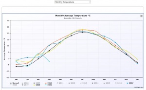
The chart shows the monthly values of the average temperature for each year. The years have a different colour according to the colour scheme. The number of series directly visible is governed by the parameter MaxNrOfSeriesVisibleInGraphs.
If the value of the inifile parameter UseNormalTempReference is Normal the user sees a black line representing the normal average values of the temperature. When UseNormalTempReference is StationAverage the user sees a grey line representing the station average values of the temperature. And obviously when the parameter value is Both, the user sees both lines. In addition to the Station Average Value line, the estimator s for the standard deviation belonging to that line, is always shown as a grey surface with the width of s for a specific month.
Yearly Temperature Statistics
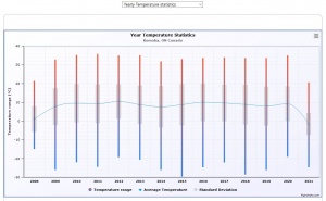
For each year the charts shows the average of the daily temperature, the range of the daily temperature and the estimator s for the standard deviation belonging to that average. The colours of this chart are hardcoded and cannot be changed. Moving the mouse around provides the specific values in the tooltips.
Yearly Temperature statistics per Month
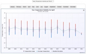
This chart is similar to the previous one, only now the the user can select a specific month through a row of buttons on top of the chart.
Warmer Days
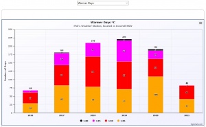
This chart shows a stacked column per year showing the number of days with a temperature larger than or equal to 25 °C. If the user use Fahrenheit, the boundaries are converted to the equivalent value in Fahrenheit, so 25 °C becomes automatically 77 °F. The classes used are 25-30 °C, 30-35 °C, 35-40 °C and 40+ °C. If climate changes faster then we think, another class will be added.
The colours of this chart are hardcoded and cannot be changed. Moving the mouse around in the column sections provides the specific values in the tooltips.
Frost Days
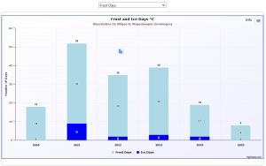
This chart shows a stacked column per year showing the number of frost days (with a temperature less than 0 °C (32 Fahrenheit) but the maximum is above 0 °C) and the number of ice days (where the maximum temperature is below zero (or 32 Fahrenheit))
If the user uses Fahrenheit, the boundaries are converted to the equivalent value in Fahrenheit, so 0 °C becomes automatically 32 °F.
The colours of this chart are hardcoded and cannot be changed. Moving the mouse around in the column sections provides the specific values in the tooltips.
The info button
A Frost Day is defined as a day where the minimum temperature is below zero (or 32 Fahrenheit) but the maximum is above zero. An Ice Day is defined as a day where the maximum temperature is below zero (or 32 Fahrenheit)
Heatmap
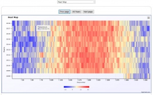
This chart shows the Heatmap for all days in the Dayfile.
When the number of years is larger than the number set in parameter HeatmapNumberOfYearsPerPage, the chart is split in pages with only HeatmapNumberOfYearsPerPage years shown. At the same time buttons appear on top the chart (see image) to give the user the possibility to browser the subsequent years or show all years if he wishes.
