Charts - Temperature charts: Difference between revisions
(Initial edit) |
|||
| Line 12: | Line 12: | ||
== Monthly Temperature == |
== Monthly Temperature == |
||
[[File:Monthly Temperatures.jpg|thumb|right|Monthly Temperatures]] |
|||
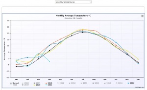
The chart shows the monthly values of the average temperature for each year. The years have a different colour according to [[Charts#Colours|the colour scheme]]. The number of series directly visible is governed by the parameter [[Charts#MaxNrOfSeriesVisibileInGraph|MaxNrOfSeriesVisibleInGraphs]]. |
|||
If the value of the inifile parameter [[Charts#UseNormalTempReference|UseNormalTempReference]] is ''Normal'' the user sees a black line representing the normal average values of the temperature. When UseNormalTempReference is ''StationAverage'' the user sees a grey line representing the station average values of the temperature. And obviously when the parameter value is ''Both'', the user sees both lines. In addition to the Station Average Value line, the estimator '''s''' for the [https://en.wikipedia.org/wiki/Standard_deviation standard deviation] <math>\boldsymbol{\sigma}</math> belonging to that line, is always shown as a grey surface with the width of '''s''' for a specific month.<br> |
|||
Revision as of 11:05, 2 April 2021
Introduction
The Temperature charts submodule consists of five charts:
- Monthly Temperatures - Plotting the monthly average temperatures for every year in the dayfile
- Yearly Temperature statistics - Plotting the average, range and standard deviation for for the temperature in every year
- Yearly Temperature statistics per month - Plotting the average, range and standard deviation for for the temperature in each month in every year
- Warmer Days - Plotting the number of days with a temperature higher than 25 °C as stacked column in classes of 5 degree width
- Heatmap - Showing a heatmap chart for all data available
Below you will find an example image of each chart and an explanation of the origin of the numbers
Monthly Temperature
The chart shows the monthly values of the average temperature for each year. The years have a different colour according to the colour scheme. The number of series directly visible is governed by the parameter MaxNrOfSeriesVisibleInGraphs.
If the value of the inifile parameter UseNormalTempReference is Normal the user sees a black line representing the normal average values of the temperature. When UseNormalTempReference is StationAverage the user sees a grey line representing the station average values of the temperature. And obviously when the parameter value is Both, the user sees both lines. In addition to the Station Average Value line, the estimator s for the standard deviation belonging to that line, is always shown as a grey surface with the width of s for a specific month.

